Harry Writes Matt Draws
New brand identity and collateral.
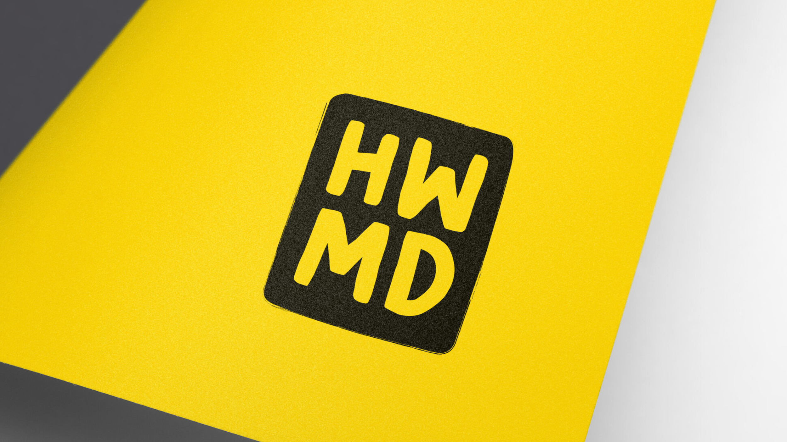
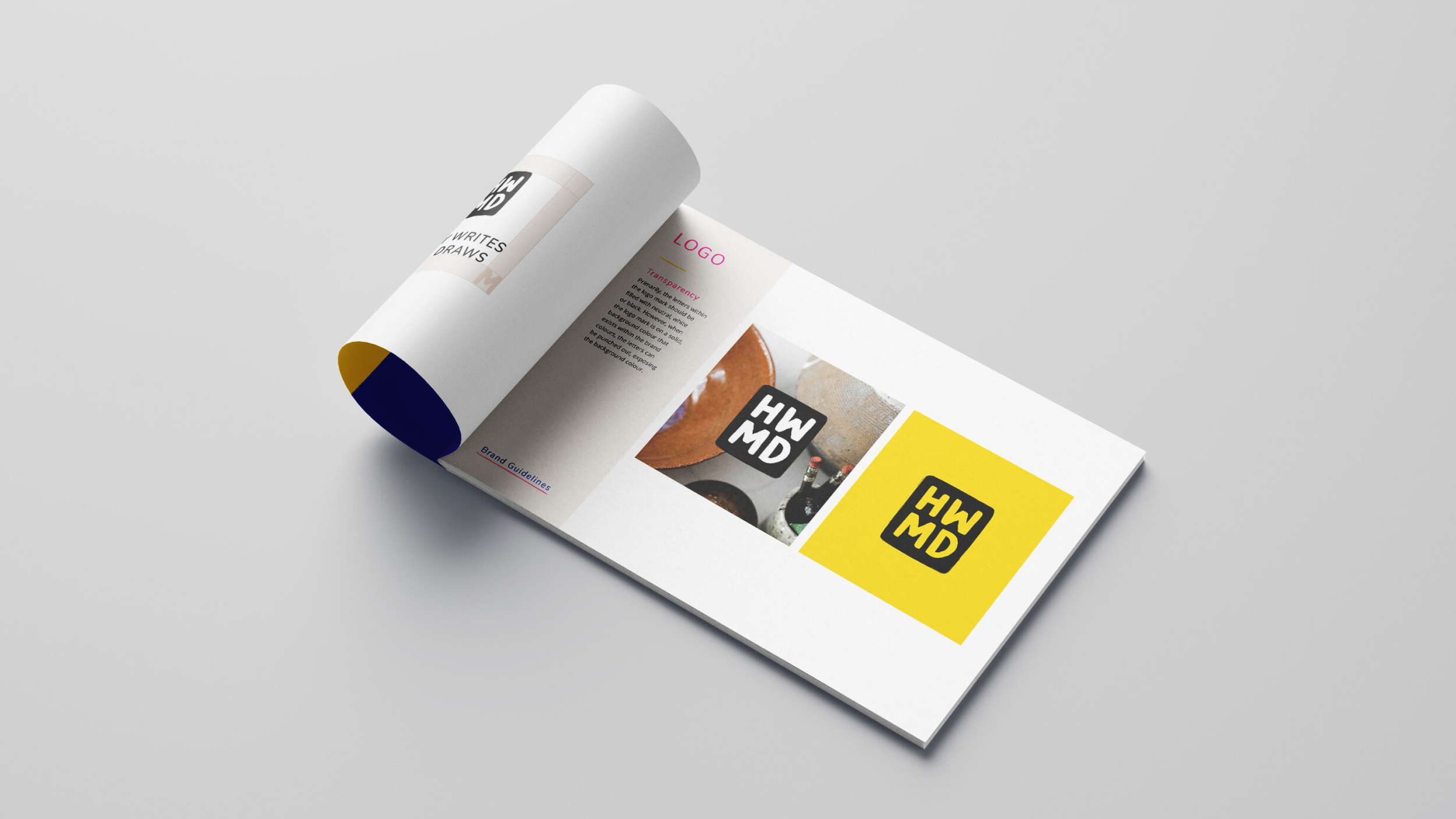
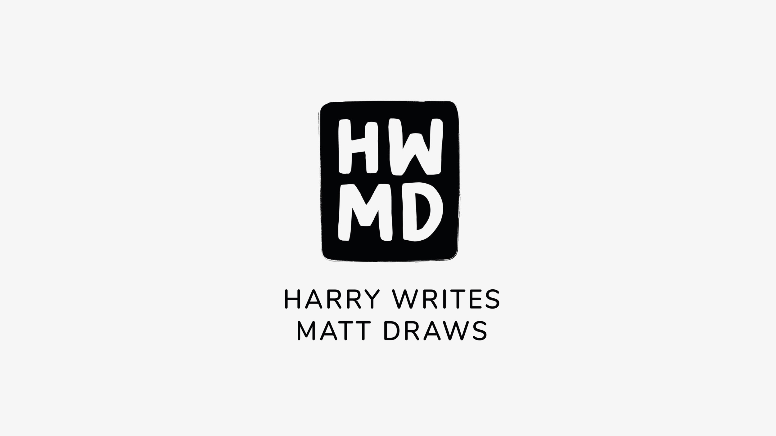
Imagination and story telling was the core theme of this project; the shape of the stamp represents a speech bubble and is used to house the company initials. This creates a bold mark whilst the painterly, hand drawn typeface adds a playful feel. The primary colours of black and white solidify that this is a professional company whilst the bright secondary colours introduce a sense of joy.